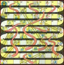
 We have all played this classic board game and we have the same problem. We move our game pieces in the wrong direction. I do it every time. My kids do it every time. It’s just not clear which direction to move your pieces. And yes, I’m embarrassed that I get confused playing Chutes and Ladders.
OK, I realize there are numbers on the squares, but is this really a counting game? If you are old enough to count to 100, you are probably already bored of this lame game. If the numbers filled each square, maybe you could make the case that it’s a counting game, but I think it’s just a bad design.
We all remember the board: It’s just a simple grid with pictures, chutes, ladders, and some small numbers. We have the Dora version and the Elmo version and they all have the same weak design. It doesn’t have to be like this.
 Here’s a mock-up I put together in a couple of minutes. Obviously, this is just a quick mock-up, but it gives you the idea. The board could easily be designed as a path and not just a grid. A basic children’s game should be designed for young children.
This is the kind of bad design that drives me crazy.
We put up with a bad user experience because we’re just used to it (see any Microsoft product). I don’t think this game was supposed to be complicated, but it is because of bad design.
Do you agree? Are there board games that you think are bad designs?


