We love designing a website when the client has a terrible website or no site at all. We come out looking like geniuses. What do we do when the original site is good…or worse, a site designed by us?
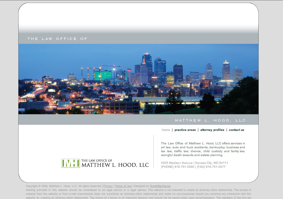
Here is example of a site we just redesigned: The Law Office of Matthew L. Hood. We like the original design. It was a solid solution to their needs a year ago. The firm is a general practice firm that was just opening and needed a web presence. The design was clean and elegant with simple navigation. We positioned the firm as professional and modern.
Recently, the client has added a bankruptcy practice and wanted to focus on that (but not exclusively). They have realized that the website is a great marketing tool and has brought in some business. We advised them to redesign the whole site to accomplish their new goals.

We redesigned the site to enhance their search engine optimization. New tags and sections were added to increase their visibility.
The bankruptcy practice has become it’s own section on the site and the first button on the navigation. With additional links, text, and images on the homepage, that bankruptcy is clearly a main practice of the firm.
We also changed from one static skyline shot on the homepage to a Flash slideshow to help tell the firm’s story.
We enlarged the phone number and moved it to a place of prominence to help drive business to the firm. We also have contact forms on every page as well as an embedded map.
We used to handle overflow text with scrolling text boxes but now allow the entire page to scroll. Now that there is a greater quantity of content, this was a necessary change.
I think we kept what was working with the original site and enhanced the design with new features and focus. This approach makes sense for new companies…We didn’t blow their budget in the first place, so they we able to hire us to update the site after only a year.
website 2.0


