773.732.4782

magnifying glass on colors

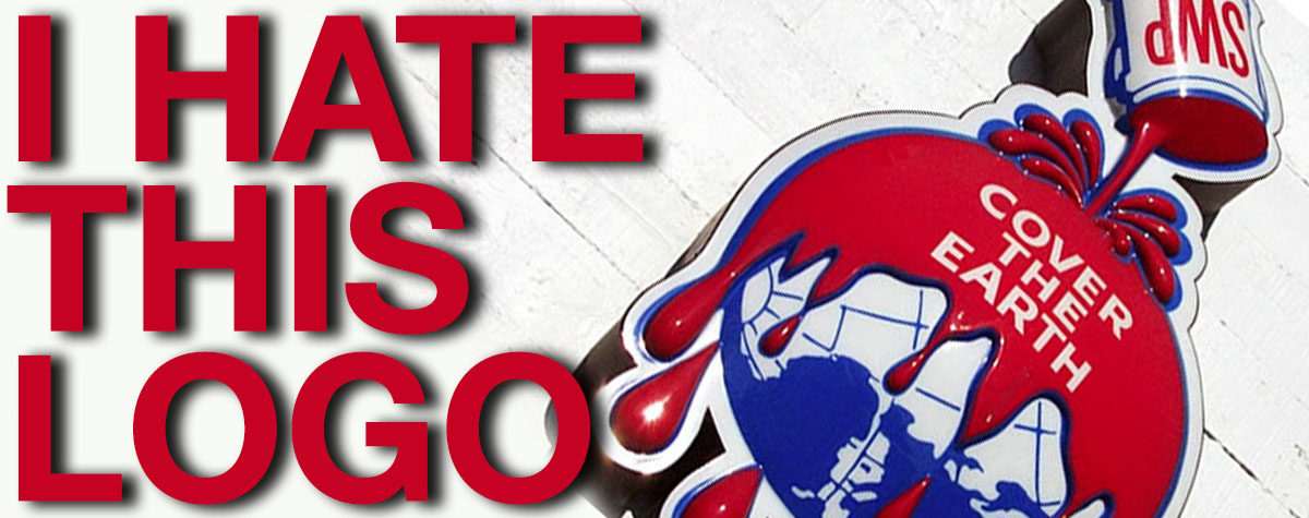
This may be my least favorite logo of all time.  Seriously, a giant can of paint is dumped over the entire planet?  Do we want to paint our oceans and forests?! This is terrifying!

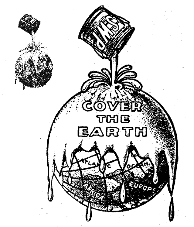
Ok, fine, the logo was designed back in 1905 before they knew stuff like the dangers of lead paint.  This isn’t some dusty old logo that we see on old paint cans…they are still using this image.  Sherwin Williams is putting this sign on new building to this day.  This is a major paint company with some huge marketing budget.  They have updated the logo and actually kept the idea of destroying the planet with paint! Look how the Earth is turned.  Africa and Europe are on the bottom. Is this a logo or a waring about the dangers of communism spreading to North America.

Nobody is Buying your Paint Because of “Cover the Earth”

The logo is bad enough, but with the tagline “cover the Earth” it’s even worse. Is this a tagline or a threat? Some companies are just afraid of change. They can’t see the forest through the trees…Maybe the forest was flooded with red paint.  I’m sure the company thinks that a logo update would somehow destroy their business. This is not a classic old logo that brings back fond memories.  This is a shitty logo that a company is afraid to update. If they phased this out, nobody would even notice. They are missing that an updated logo is an opportunity to communicate to the public.  Maybe something like “color your world” would be better than “dump a can of paint on the planet and kill all who live there”. When you update your brand, you give consumers a reason to look at your company.  You communicate that you are a modern company that keeps up with society.  It’s like giving your company a fresh coat of paint…as opposed to just dumping a giant can of paint on your brand. Also, do we need the “SWP” on the paint can.  Are they worried that we might think Benjamin Moore paint was used in Sherwin Williams’ logo? I checked out their website to see how it works online.  The logo was so small that you can’t even make it out.  The site didn’t load properly…so this company clearly has some issues. What is your least favorite logo?